Scatterplots in D3 with Voronoi Interaction
D3 v4.3.0 was just released, and it came with a notable new feature: diagram.find for d3-voronoi. With this great addition, we are now able to easily find which Voronoi region is under the mouse without rendering the Voronoi diagram polygons and relying on SVG mouse handlers. This means we can use Voronoi interactive behavior when other overlays in the vis consume mouse events, such as when using d3-brush, or even when using canvas instead of SVG-- but those are topics for another post.
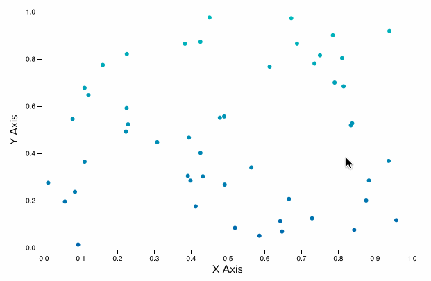
In this post, I break down how we can make use of the new find() function by using it to access the nearest point to the mouse in a scatterplot.
Why Voronoi?
We can think of a Voronoi diagram as a method for expanding the hit area around points in a chart. Each point becomes a non-overlapping region such that if the mouse is inside that region, that point is the closest point to the mouse.
The main benefit of using a Voronoi diagram for highlighting the points in a scatterplot is that the regions defined by the diagram are typically much larger than the points, making it easier for users to explore the data. It's also a more efficient method than computing the nearest point to the mouse position every time the mouse moves since we can precompute the Voronoi diagram once and re-use it as we need it.
Without further adieu, let's get to making a simple scatterplot with interactivity powered by Voronoi diagrams!
Building a Basic Scatterplot
Let's start with describing how to build a simple scatterplot in D3. If you already know this, feel free to skip to the next section on adding the Voronoi-powered interaction.
Generating Random Data
Before we even get started, let's generate some random data that we can use for testing out the scatterplot. We can do this easily with d3.range.
// generate random data for 50 points
const data = d3.range(50).map((d, i) => ({
  x: Math.random(),
  y: Math.random(),
  id: i,
  label: `Point ${i}`,
}));
With that, we have an array of 50 random data points we can use with our chart.
Terminology
I use slightly different terminology for the parts of a chart than is commonly seen on D3 blocks. The standard seen in blocks is to have width and height describe the interior dimensions of the chart. I prefer to have width and height correspond to the actual outer width and height of the SVG container. I find this makes it easier to reason about when trying to layout multiple charts on a page, and is especially useful when the charts are packaged as reusable components.

As shown in the diagram above, I use the following terms to describe the different parts of the chart:
width | The outer width of the chart |
height | The outer height of the chart |
plotAreaWidth | The inner width of the chart, where the circles are plotted |
plotAreaHeight | The inner height of the chart, where the circles are plotted |
padding | The space between the outer border and the inner area (the plot area). |
Setting up the Chart
With that out of the way, let's get started with the code for building the chart. We first define the dimensions and padding for our scatterplot.
// outer svg dimensions
const width = 600;
const height = 400;

// padding around the chart where axes will go
const padding = {
  top: 20,
  right: 20,
  bottom: 40,
  left: 50,
};

// inner chart dimensions, where the dots are plotted
const plotAreaWidth = width - padding.left - padding.right;
const plotAreaHeight = height - padding.top - padding.bottom;

// radius of points in the scatterplot
const pointRadius = 3;
With these base values defined, we can next define the scales we'll use for our x and y axes and for coloring the points. Since we used Math.random() to generate the x and y values, we know the domains are [0, 1], otherwise we could have used d3.extent to find the min and max values in the dataset and used those for the domains.
// initialize scales
const xScale = d3.scaleLinear().domain([0, 1]).range([0, plotAreaWidth]);
const yScale = d3.scaleLinear().domain([0, 1]).range([plotAreaHeight, 0]);
const colorScale = d3.scaleLinear().domain([0, 1]).range(['#06a', '#0bb']);
We now have all the constants and scales we need to begin generating the SVG for our chart. We do the standard procedure of creating an <svg> element with a <g> tag translated inside it to reflect our desired padding.
// select the root container where the chart will be added
const container = d3.select('#vis-container');

// initialize main SVG
const svg = container.append('svg')
  .attr('width', width)
  .attr('height', height);

// the main g where all the chart content goes inside
const g = svg.append('g')
  .attr('transform', `translate(${padding.left} ${padding.top})`);
The base of the chart is now setup. Next we add the axes.
Adding in Axes
Adding in axes to charts is fairly simple with D3, since it comes with built-in helpers via d3-axis for generating them with reasonable defaults. Here we create the <g> tags to use with d3-axis as well as <text> tags to use as axis titles.
// add in axis groups
const xAxisG = g.append('g').classed('x-axis', true)
  .attr('transform', `translate(0 ${plotAreaHeight + pointRadius})`);

// x-axis label
g.append('text')
  .attr('transform', `translate(${plotAreaWidth / 2} ${plotAreaHeight + (padding.bottom)})`)
  .attr('dy', -4) // adjust distance from the bottom edge
  .attr('class', 'axis-label')
  .attr('text-anchor', 'middle')
  .text('X Axis');

const yAxisG = g.append('g').classed('y-axis', true)
  .attr('transform', `translate(${-pointRadius} 0)`);

// y-axis label
g.append('text')
  .attr('transform', `rotate(270) translate(${-plotAreaHeight / 2} ${-padding.left})`)
  .attr('dy', 12) // adjust distance from the left edge
  .attr('class', 'axis-label')
  .attr('text-anchor', 'middle')
  .text('Y Axis');

// set up axis generating functions
const xTicks = Math.round(plotAreaWidth / 50);
const yTicks = Math.round(plotAreaHeight / 50);

const xAxis = d3.axisBottom(xScale)
  .ticks(xTicks)
  .tickSizeOuter(0);

const yAxis = d3
  .axisLeft(yScale)
  .ticks(yTicks)
  .tickSizeOuter(0);

// draw the axes
yAxisG.call(yAxis);
xAxisG.call(xAxis);
A couple things of note:
- By default, d3-axis will add squared ends to the axes. Unless these ends happen to overlap one of the ticks, there will be strange spacing between them and the actual ticks of the axis, so I always call
.tickSizeOuter(0)to remove them. - The number of ticks in the axes,
xTicksandyTicks, are based on the dimensions of the chart. By doing this instead of using a constant value, we ensure that our ticks do not get too compressed or too sparse as the dimensions of the chart change.
Next, we draw the points as circles.
Drawing the Points
In this example, I'm only showing the enter step of D3's update pattern, so we just bind the data to a collection of circles and render them using our scales.
// add in circles
const circles = g.append('g').attr('class', 'circles');

const binding = circles.selectAll('.data-point').data(data, d => d.id);

binding.enter().append('circle')
  .classed('data-point', true)
  .attr('r', pointRadius)
  .attr('cx', d => xScale(d.x))
  .attr('cy', d => yScale(d.y))
  .attr('fill', d => colorScale(d.y));
We now have a scatterplot! 🎉

With that out of the way, let's take a look at how we can use a Voronoi diagram to add interactivity to the chart.
Adding Interactivity with a Voronoi Diagram
The first thing we need to do is make use of d3-voronoi to compute the Voronoi diagram of the points.
// create a Voronoi diagram based on the data and the scales
const voronoiDiagram = d3.voronoi()
  .x(d => xScale(d.x))
  .y(d => yScale(d.y))
  .size([plotAreaWidth, plotAreaHeight])(data);
That's all it takes to compute the diagram! And the size() call is optional since we aren't going to use the polygons feature of the diagram. Note that we call the configured function with (data) at the end, which is what computes the diagram based on our generated data.
Now that we have a computed Voronoi diagram, let's add in some some mouse listeners to make use of it. We'll draw an invisible rectangle over the plot area of the chart that will listen for mouse events and use the Voronoi diagram to highlight the nearest point to the mouse.
// limit how far away the mouse can be from finding a Voronoi site
const voronoiRadius = plotAreaWidth / 10;

// add a circle for indicating the highlighted point
g.append('circle')
  .attr('class', 'highlight-circle')
  .attr('r', pointRadius + 2) // slightly larger than our points
  .style('fill', 'none')
  .style('display', 'none');

// callback to highlight a point
function highlight(d) {
  // no point to highlight - hide the circle
  if (!d) {
    d3.select('.highlight-circle').style('display', 'none');

  // otherwise, show the highlight circle at the correct position
  } else {
    d3.select('.highlight-circle')
      .style('display', '')
      .style('stroke', colorScale(d.y))
      .attr('cx', xScale(d.x))
      .attr('cy', yScale(d.y));
  }
}

// callback for when the mouse moves across the overlay
function mouseMoveHandler() {
  // get the current mouse position
  const [mx, my] = d3.mouse(this);

  // use the new diagram.find() function to find the Voronoi site
  // closest to the mouse, limited by max distance voronoiRadius
  const site = voronoiDiagram.find(mx, my, voronoiRadius);

  // highlight the point if we found one
  highlight(site && site.data);
}

// add the overlay on top of everything to take the mouse events
g.append('rect')
  .attr('class', 'overlay')
  .attr('width', plotAreaWidth)
  .attr('height', plotAreaHeight)
  .style('fill', '#f00')
  .style('opacity', 0)
  .on('mousemove', mouseMoveHandler)
  .on('mouseleave', () => {
    // hide the highlight circle when the mouse leaves the chart
    highlight(null);
  });
The important part is how we used voronoiDiagram.find() to find the nearest Voronoi site to the mouse:
const site = voronoiDiagram.find(mx, my, voronoiRadius);The site object returned from this function contains a key data that returns one of the data points from our original data array. We then use that data point to update the position of our highlight circle, indicating to the users which point is highlighted. Since we used a Voronoi diagram, it will be the point nearest the mouse.
This method gives us access to the highlighted data point-- we can do whatever we like with it! In the demo, I show how we can display the contents of the highlighted point in a <div> beneath the chart.
Note that I arbitrarily set the voronoiRadius to 1/10th the width of the plot area:
const voronoiRadius = plotAreaWidth / 10;This makes it so the point is only highlighted if you're relatively close to it, even if you are in the corresponding voronoi cell. Feel free to play with this value to get something that works for you!
Conclusion
That's it! We've got a basic scatterplot with hover behavior driven by a Voronoi diagram. My next post will show how we can add a brush to our scatterplot to select points efficiently with a quadtree, all while retaining the hover behavior shown in this post.
If you have any questions or comments, please leave a comment below or send me a tweet @pbesh. In case you missed it, there's a live demo of this code on my site and the full source code is available on GitHub.